6/01/2011

Design History (week 5)

This week we talk about some interesting pieces of art... The influence of Moder Art & Pictorial Modernism. I was not a big fan of these chapters because they are scary, gross and little creappy. However, the only thing I did like was that they were colorful and bold. Dada's magazines are somewhat interesting... they are different from normal magazines. The type was different -- On an angle, tilted and almost creative (like images sometimes).
One piece of art that I did enjoy and thought was cool / interesting was, "Kassama Corn Flour"... Beggarstaffs poster. (14-1) The beggarstaffs, poster for "Kassama Corn Flour", 1894. Their straight forward style was firmly established in one of their earlier posters. This designer made these posters have color, but they were very flat. They used a black spot (to catch your eye) and they had no detail in the face, body, or background. "Kassama Corn Flour" is very simple, clean and I really like this style.
* Like I said before... this designer uses flat colors, text and image in there posters. *


5/24/2011

Design History (week 4)


This week we talk about Art Nouveau... and The genesis of 20th century design. But the piece of art that I like was in chapter 11; page 209. (11-43)


Will Brady, poster for "The Chap Book" in 1895. Repetition of the figure on a smaller size, overlapping the larger figure, enabled Bradley to crete a complex set of visual relationships. I really like his poster, it very interesting. It's very simple and doesn't have to much detail (in most some of his posters). When I first saw this poster "The Chap Book", I thought I saw one person, But now that I look at this poster again, I see two peole holding platers of food or something. I just like the colors of this poster... it's makes me want to pick this is & start reading it.


Some other posters Will Bradley did are, "The In;and Printer" (1895) & "Bradley" (1898)... Both of these have about the dame background, colorful, lots fo detail and fansy fonts. They are very interesting... it also catches your eye.


5/19/2011

Design History (week 3)

This week we watch a movie called "Typeface" and talk about chapters 9 and 10 in our book "Meggs' History of Graphic Design". In these two chapters we talked about graphic design - the industrial revolution. (And) The arts and crafts movement.
What got my interest was the photography section. I looked up the definition of photography and it says that "the art or practice of taking and processing photographs".


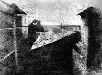
Joseph Niepce was the first person who produced photographic images. His first picture on the left is nice, but a little confusing and hard to look at. When I first saw this pictures I wasn't sure what it was... but look like some kind of view. So when I read about this pictures I know what I am looking at. In this picture its a view looking out at a courtyard. Some of the shadows we see are a tree, house, barn and a chimney.

Another images I found interesting was actually made into a motion picture. Eadweard Muybridge, plate published in "The Horse in Motion" in 1883. It's amazing how he took some pictures of the horse at the same spot, but the the horse's movement was different every time. I just enjoy old fashion pictures & motion pictures.

5/18/2011

Movie - Typeface

Design History

Movie – Typeface

This movie “Typeface” takes place in Two Rivers in Wisconsin. The Hamilton, the company is a nice place to visit... To bad it's 5 hours away. (Field trip!!) Anyways, this small town is very popular since Ice Cream Sundaes were made there. This movie was quite interesting and I'd like to visit it some time. I never knew that small company grew so big… they were popular with wood type. In the beginning of the movie, it starts off with wooden type. They show us how they design and carve the type it out of wood. It's amazing what different sized they used to make ad's, poster and more. Also it was funny how the old folks in the movie talk about what they did back in the day when they work at Hamilton. Now some of them are retired or has pasted away. Next, the movie talk about move-able type, how it was popular, but now it has faded away. He no longer use move-able type as much as they did in the early 1900's. Now we use computers and technology to create out typefaces, poster's, ad's and more. And lastly, the movie talks about different types of printing. Just like typefaces & move-able type... some printing has faded too. We no longer use off-set printers. Like I said before... Now we use computers and technology to create out typefaces, poster's, ad's and more.

This was a good movie, describing all about wooden type, printing and designing type. It's just amazing how we started off using move-able type to make letters, words and books. Now we have technology to do it for us. A couple years ago, I got to print some note pads and cards on an OFF-SET PRESS. It's amazing how that machine works. You have to make you logo's (or images) on a computer and then you print it out on special paper. Then your transfer this paper to a metal plate. You put the plate into the off-set press. Add the color ink, Add the paper and start printing.

:)

my company...

My company (Home-made Goodies)

We are the only company that makes home-made and fresh goodies (Brownies, cookies, cakes, pastry's and more.

Logo's

Design 3 : Logo's

Here are some logo's that I have come up for my project. I am making brownies (Fudgy Saucepan Brownies). However, if I were to expand, I would not only make brownies, but cookies, cakes, pastry's and more. The Name of my Company is called "Home-made Goodies"
When I was creating these logo's I was trying to get that home made feeling. I wanted to get something different than my competitors.Some of these logo's reminds me of my competitors: Betty Crocker, Pillsbury and others. I hope all my costumers and you like my logo's.