Some other posters Will Bradley did are, "The In;and Printer" (1895) & "Bradley" (1898)... Both of these have about the dame background, colorful, lots fo detail and fansy fonts. They are very interesting... it also catches your eye.
5/24/2011
Design History (week 4)
Some other posters Will Bradley did are, "The In;and Printer" (1895) & "Bradley" (1898)... Both of these have about the dame background, colorful, lots fo detail and fansy fonts. They are very interesting... it also catches your eye.
5/19/2011
Design History (week 3)
5/18/2011
Movie - Typeface
Design History
Movie – Typeface
This movie “Typeface” takes place in Two Rivers in Wisconsin. The Hamilton, the company is a nice place to visit... To bad it's 5 hours away. (Field trip!!) Anyways, this small town is very popular since Ice Cream Sundaes were made there. This movie was quite interesting and I'd like to visit it some time. I never knew that small company grew so big… they were popular with wood type. In the beginning of the movie, it starts off with wooden type. They show us how they design and carve the type it out of wood. It's amazing what different sized they used to make ad's, poster and more. Also it was funny how the old folks in the movie talk about what they did back in the day when they work at Hamilton. Now some of them are retired or has pasted away. Next, the movie talk about move-able type, how it was popular, but now it has faded away. He no longer use move-able type as much as they did in the early 1900's. Now we use computers and technology to create out typefaces, poster's, ad's and more. And lastly, the movie talks about different types of printing. Just like typefaces & move-able type... some printing has faded too. We no longer use off-set printers. Like I said before... Now we use computers and technology to create out typefaces, poster's, ad's and more.
This was a good movie, describing all about wooden type, printing and designing type. It's just amazing how we started off using move-able type to make letters, words and books. Now we have technology to do it for us. A couple years ago, I got to print some note pads and cards on an OFF-SET PRESS. It's amazing how that machine works. You have to make you logo's (or images) on a computer and then you print it out on special paper. Then your transfer this paper to a metal plate. You put the plate into the off-set press. Add the color ink, Add the paper and start printing.
:)
my company...
We are the only company that makes home-made and fresh goodies (Brownies, cookies, cakes, pastry's and more.
Design 3 : Logo's
When I was creating these logo's I was trying to get that home made feeling. I wanted to get something different than my competitors.Some of these logo's reminds me of my competitors: Betty Crocker, Pillsbury and others. I hope all my costumers and you like my logo's.
5/14/2011
Product and Company Development
Box Mix: $4 to $8 & Homemade: $10+
2. Who is the market for the product?
The target audience is primarily women (any age)... those who love to bake.
3. Who will buy the product?
Anyone: Men, Women and children.
4. What types of color schemes are appropriate for this market?
Some colors I pick out are: Brown, black, cream, and red.
5. What type of typography is suitable? What are some possible typefaces?
Lucida Calligraphy Italic (OR) Charrlemagne Std Bold.
6. If the market and the purchaser are different, how can you create a logo that appeals to both?
Image of products; Add color choices that are gear to your product And something that both men & women will enjoy buying.
7. What qualities will the company logo communicate? What words describe your company?
This product should communicate to be enjoyable, fun, and great taste. And words that describe the company are, homemade taste, Home-Sweet-Home, Relaxed and professional
8. What words describe your product?
Sweet, Chocolaty-ness, Fudgy, Yummy Goodness, Deliciousness and more many more.
9. What are the major strengths of the company?
By being a new business, you can create business cards, ad's and coupons to spreading the word out, about your company and it's newest product.
10. What are the weaknesses of the company?
Being a new company, it will be hard competing with other competitors.
11. Who are the competitors for this product?
The leading competitors for this product is Homemade bakers OR Store products: Betty Crocker, Pillsbury, and Duncan Hines.
5/11/2011
Design History (week 2)
Design History (week 2)

5/09/2011
The Creative Brief
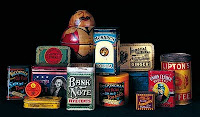
Chromolithography is a method for making multi-color prints. This type of color printing stemmed from the process of lithography, and it includes all types of lithography that are printed in color. Package design chromolithographed on tin for food and tobacco produces used bright flat colors, elaborate lettering, and iconic images to create an emblematic presence for the product.
Lithographers sought to find a way to print on flat surfaces with the use of chemicals instead of relief or intaglio printing. Chromolithography became the most successful of several methods of color printing developed by the 19th century; and mostly relied on using several woodblocks with the colors. Hand coloring also remained important; boy is colored elements of the official British Ordnance Survey maps by hand until 1875.
I believe that the client is both men and women (any age). I see them shopping in the grocery store buying food. They see this bright flat colors product and they wonder what it use is for? On the other hand, what it may taste like? They are curious about the color or shape of the product.
The message of Chromolithography is a way to get you to buy (or try) this. In a way Chromolithography is like advertisements with images... relied heavily on an initial black print was not always a lithograph.
I believe the strategy of this product is a little crazy and old fashion.
http://arh346.blogspot.com/2007/09/package-designs-chromolithographed-on.html
5/04/2011
Design History
Design History
The other day we talk about many interesting pieces of art. Just like the Sumerians who developed writing language that increase knowledge, stabilized laws, and made out of clay. Then we talk about Egyptians who use hieroglyphics and who develop the papyrus and manuscripts that tell stories.
· Phoenician alphabet arose from a need for communication. In addition, it develops sound speech rather than objects (pictographs).
I pictures that I found is the "Wounded
Bison Attacking a Man"
is a cave painting from Lascaux, France that was painted somewhere around
15,000 years ago. It's amazing how these people created paintings.


