NEW WEBSITE!!!
http://aprilannephoto.weebly.com
8/12/2011
6/30/2011
Design History - Week 9
As we finish up with week nine, we come to the end of our book "Meggs History of Graphic Design". There were some very interesting pictures, graphic and people in this book. This week I have picked Paula Scher's “Swatch Watch” poster made in 1985.
Paula Scher's Swatch Ad appropriates Herbert Matter's well-known 1934 Swiss travel poster as its source. The statement had an enormous impact among graphic designers. The notion is that nothing original can be made (that has not been made already). In addition, he copies it and change it a little... he put in his only little touch. In some ways there are very similar, unless you look closely. The faces are different, the type is different color, and the post itself is a different color. As I was doing my research I came around lots of designer that have copy other designer’s ideas and change them around (and mark them as there only design… it’s funny how these people can just away with these and not get caught. I always remember my high school & college teacher telling us not to copy other people’s answers or design. In addition, here we are learning about Paula Scher's Swatch Ad vs. Herbert Matter's well-known 1934 Swiss travel poster.
All I have to say is INTERESTING!! :)

Paula Scher's Swatch Ad appropriates Herbert Matter's well-known 1934 Swiss travel poster as its source. The statement had an enormous impact among graphic designers. The notion is that nothing original can be made (that has not been made already). In addition, he copies it and change it a little... he put in his only little touch. In some ways there are very similar, unless you look closely. The faces are different, the type is different color, and the post itself is a different color. As I was doing my research I came around lots of designer that have copy other designer’s ideas and change them around (and mark them as there only design… it’s funny how these people can just away with these and not get caught. I always remember my high school & college teacher telling us not to copy other people’s answers or design. In addition, here we are learning about Paula Scher's Swatch Ad vs. Herbert Matter's well-known 1934 Swiss travel poster.
All I have to say is INTERESTING!! :)

6/29/2011
Creative brief #3
Creative Brief #3
1. Identification? Symbols Signs - they are every where and there very important for us to know.
2. What are the project and the problem?
The project is the symbols of these signs, to understand what you want and where you need to go. The problem might be that you don't really need to understand the language, but you need the to know the knowledge of these signs.
3. Who is the client?
Roger Cook and Don Shanosky signage symbols system for the U.S. Department of Transportation in 1974. And today these symbol signs are still used all over the world... on train station, air ports, subways, malls and more.
4. Who is the intended audience?
Everyone (Men, Women, children and when pets).
5. What is the core message?
A symbol is something such as a particular mark that represents some piece of information. For example, a red octagon may be a symbol for "STOP". On a map, a picture of a table might represent a campsite. Numerals are symbols for numbers. All language consists of symbols. These graphic are very simple, easy and understandable when in a different language.
6. What is the hoped-for outcome?
To get people to understand these symbols, when if they are in a different language.
7. What is the graphic strategy?
Symbols Signs - they are every where and there very important for us to know. These graphic are very simple, easy and understandable (when in a different language).

1. Identification? Symbols Signs - they are every where and there very important for us to know.
2. What are the project and the problem?
The project is the symbols of these signs, to understand what you want and where you need to go. The problem might be that you don't really need to understand the language, but you need the to know the knowledge of these signs.
3. Who is the client?
Roger Cook and Don Shanosky signage symbols system for the U.S. Department of Transportation in 1974. And today these symbol signs are still used all over the world... on train station, air ports, subways, malls and more.
4. Who is the intended audience?
Everyone (Men, Women, children and when pets).
5. What is the core message?
A symbol is something such as a particular mark that represents some piece of information. For example, a red octagon may be a symbol for "STOP". On a map, a picture of a table might represent a campsite. Numerals are symbols for numbers. All language consists of symbols. These graphic are very simple, easy and understandable when in a different language.
6. What is the hoped-for outcome?
To get people to understand these symbols, when if they are in a different language.
7. What is the graphic strategy?
Symbols Signs - they are every where and there very important for us to know. These graphic are very simple, easy and understandable (when in a different language).

6/26/2011
Design History (week 8)
ART & COPY
This movie was a powerful new film all about advertising and inspiration. George Lois, Mary Wells, Dan Wieden, and others featured in "ART & COPY", were responsible for "Just Do It," "I Love NY," "Where's the Beef?," "Got Milk," and other campaigns. They came up with these catchy logos, and words to grab our attention... And the attention of many other million people in our world today. Ad's today are everywhere, on newpapers, TV, billboards, clothes, and more. We can't go onestep without seeing an Ad's for food, clothes, and even businesses. The social and cultural impact of their ads are brought to light in this dynamic exploration of art, commerce, and human emotion.
This was an very interesting piece of film. Yes, a little boring at first, but it gets your attention. This movie was showing us ways about advertising. I know how hard it is to get your business out in the world today. Everyone is differnt and every business is different. For example: I have a photogaphy business and my friends also have a photogaphy business. But what makes us different is our packagaing, prices and differnt style of photogaphy. (Like I said before... Everyone is differnt and every business is different.
This movie was a powerful new film all about advertising and inspiration. George Lois, Mary Wells, Dan Wieden, and others featured in "ART & COPY", were responsible for "Just Do It," "I Love NY," "Where's the Beef?," "Got Milk," and other campaigns. They came up with these catchy logos, and words to grab our attention... And the attention of many other million people in our world today. Ad's today are everywhere, on newpapers, TV, billboards, clothes, and more. We can't go onestep without seeing an Ad's for food, clothes, and even businesses. The social and cultural impact of their ads are brought to light in this dynamic exploration of art, commerce, and human emotion.
This was an very interesting piece of film. Yes, a little boring at first, but it gets your attention. This movie was showing us ways about advertising. I know how hard it is to get your business out in the world today. Everyone is differnt and every business is different. For example: I have a photogaphy business and my friends also have a photogaphy business. But what makes us different is our packagaing, prices and differnt style of photogaphy. (Like I said before... Everyone is differnt and every business is different.
6/17/2011
week 7 - design history blog

Jean Carlu artwork is very interesting. When I saw this artwork, I saw manufacturing, factories, labor, hard work, and men. My guess was this was 1960's... but as I did my research, I found out that this was during World War 2 (around the 1940's). I really like the colors of this artwork. Not to bright and good use of gradient. This artwork does not show the hard too well... but with the gradient, colors and shape... it puts your artwork together.
In that period, he designed his first poster in art deco style. According to our book (Megg's History of Graphic Design)... Jean Carlu, poster for the office of Emergency management, 1941. Visual and verbal elements are in separable interlocked into an intense symbol of productively and labor.
According to the Internet... Jean Carlu was a French graphic designer, specialized in posters. He made posters during World War II to promote an increase in American production. In 1941, he received an award for the New York Art Directors Club for his poster, “America’s Answer!”
This is where I found the picture above. (http://www.designrelated.com/inspiration/view/Karen/entry/1778/jean-carlu)
6/07/2011
Design History (week6)
This week in history class, we talk about some interesting art, posters, and people. One person that caught my attention was El Lissitzky. He was a Russian artist, designer, photographer, typographer, and architect. He was influence on the artwork from the Bauhaus and De Stijl movements. El Lissitzky artwork was very constructivism with a few geometric shapes; colors of black and red; angels; borders; little orientation… almost a futurism feel. One image that El Lissitzky, has many geometric shapes, colors of black, red and angels.
According to our book “Meggs History of Graphic Design”, El Lissitzky who made the “Beat the White with the Red Wedge” in 1919. The Bolshevik army emblem a red wedge slashes diagonally into a white sphere signifying A. F. Kerensky’s white forces. The slogan four words were placed to reinforce the dynamic movement.
This image got my attention because of the geometric shapes, colors of black, red, and angels. This piece of art is very interesting… how the triangle (Wedge) is breaking into the circle. People may see this in many ways, according to our book it is a war going on. However, I also see it as people break free for freedom.

According to our book “Meggs History of Graphic Design”, El Lissitzky who made the “Beat the White with the Red Wedge” in 1919. The Bolshevik army emblem a red wedge slashes diagonally into a white sphere signifying A. F. Kerensky’s white forces. The slogan four words were placed to reinforce the dynamic movement.
This image got my attention because of the geometric shapes, colors of black, red, and angels. This piece of art is very interesting… how the triangle (Wedge) is breaking into the circle. People may see this in many ways, according to our book it is a war going on. However, I also see it as people break free for freedom.

6/02/2011
Creative Brief #2

Brief 2: Modernist Era
1. Identification?
Alexey Brodovitch is a Russian-born photographer, designer, and instructor who are most famous for his art direction of fashion magazine. This image above is the one Brodovitch created for Herbert’s Bazaar magazine cover for June 1951.
2. What are the project and the problem?
We are viewing the cover for Herbert’s Bazaar magazine... for JUNE 1951. This cover has some flat colors that almost blend in the background. In addition, there is little detail on the face and butterfly.
3. Who is the client?
Alexey Brodovitch is a Russian-born photographer, designer, and instructor who are most famous for his art direction of fashion magazine.
4. Who is the intended audience?
Women’s (young and old)
5. What is the core message?
The message on this magazine is how to make you better looking with fashion and cosmetics. Also something to read for entertainment at an doctor’s office or at a hair appointment.
6. What is the hoped-for outcome?
Alexey Brodovitch wanted to make a great magazine cover that would get young and old women's attention... so that they would but this magazine and how to make themselves look better with new fashion and cosmetics. In addition, the company wants to keep growing, so they wanted to get your attention with these front covers. And they want to you to buy and keep buying their Bazaar magazines.
7. What is the graphic strategy?
Brodovitch artwork is quite interesting and very simple. He uses some flat colors that almost blend in the background. However, there is little detail on the face and butterfly. Also, this front cover above show this lady with a butterfly in front of her face. If I didn't know what kind of magazine this was, i would wonder what in the world is this? At first glance, I see a lady & a butterfly. However, has i studying this cover closely, it almost reminds me of a mask. Now I get it... mask, hiding behind the butterfly... wearing now makeup. However, according to our book this magazine cover says -- "Brodovitch often used repetition as a design, as with the round forms on the butterfly wing and the eye of the model."
6/01/2011
Design History (week 5)
This week we talk about some interesting pieces of art... The influence of Moder Art & Pictorial Modernism. I was not a big fan of these chapters because they are scary, gross and little creappy. However, the only thing I did like was that they were colorful and bold. Dada's magazines are somewhat interesting... they are different from normal magazines. The type was different -- On an angle, tilted and almost creative (like images sometimes).
One piece of art that I did enjoy and thought was cool / interesting was, "Kassama Corn Flour"... Beggarstaffs poster. (14-1) The beggarstaffs, poster for "Kassama Corn Flour", 1894. Their straight forward style was firmly established in one of their earlier posters. This designer made these posters have color, but they were very flat. They used a black spot (to catch your eye) and they had no detail in the face, body, or background. "Kassama Corn Flour" is very simple, clean and I really like this style.
* Like I said before... this designer uses flat colors, text and image in there posters. *
One piece of art that I did enjoy and thought was cool / interesting was, "Kassama Corn Flour"... Beggarstaffs poster. (14-1) The beggarstaffs, poster for "Kassama Corn Flour", 1894. Their straight forward style was firmly established in one of their earlier posters. This designer made these posters have color, but they were very flat. They used a black spot (to catch your eye) and they had no detail in the face, body, or background. "Kassama Corn Flour" is very simple, clean and I really like this style.
* Like I said before... this designer uses flat colors, text and image in there posters. *

5/24/2011
Design History (week 4)
This week we talk about Art Nouveau... and The genesis of 20th century design. But the piece of art that I like was in chapter 11; page 209. (11-43)

Will Brady, poster for "The Chap Book" in 1895. Repetition of the figure on a smaller size, overlapping the larger figure, enabled Bradley to crete a complex set of visual relationships. I really like his poster, it very interesting. It's very simple and doesn't have to much detail (in most some of his posters). When I first saw this poster "The Chap Book", I thought I saw one person, But now that I look at this poster again, I see two peole holding platers of food or something. I just like the colors of this poster... it's makes me want to pick this is & start reading it.
Some other posters Will Bradley did are, "The In;and Printer" (1895) & "Bradley" (1898)... Both of these have about the dame background, colorful, lots fo detail and fansy fonts. They are very interesting... it also catches your eye.


5/19/2011
Design History (week 3)
This week we watch a movie called "Typeface" and talk about chapters 9 and 10 in our book "Meggs' History of Graphic Design". In these two chapters we talked about graphic design - the industrial revolution. (And) The arts and crafts movement.
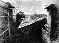
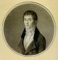
What got my interest was the photography section. I looked up the definition of photography and it says that "the art or practice of taking and processing photographs".
Joseph Niepce was the first person who produced photographic images. His first picture on the left is nice, but a little confusing and hard to look at. When I first saw this pictures I wasn't sure what it was... but look like some kind of view. So when I read about this pictures I know what I am looking at. In this picture its a view looking out at a courtyard. Some of the shadows we see are a tree, house, barn and a chimney.
Another images I found interesting was actually made into a motion picture. Eadweard Muybridge, plate published in "The Horse in Motion" in 1883. It's amazing how he took some pictures of the horse at the same spot, but the the horse's movement was different every time. I just enjoy old fashion pictures & motion pictures.
5/18/2011
Movie - Typeface
Design History
Movie – Typeface
This movie “Typeface” takes place in Two Rivers in Wisconsin. The Hamilton, the company is a nice place to visit... To bad it's 5 hours away. (Field trip!!) Anyways, this small town is very popular since Ice Cream Sundaes were made there. This movie was quite interesting and I'd like to visit it some time. I never knew that small company grew so big… they were popular with wood type. In the beginning of the movie, it starts off with wooden type. They show us how they design and carve the type it out of wood. It's amazing what different sized they used to make ad's, poster and more. Also it was funny how the old folks in the movie talk about what they did back in the day when they work at Hamilton. Now some of them are retired or has pasted away. Next, the movie talk about move-able type, how it was popular, but now it has faded away. He no longer use move-able type as much as they did in the early 1900's. Now we use computers and technology to create out typefaces, poster's, ad's and more. And lastly, the movie talks about different types of printing. Just like typefaces & move-able type... some printing has faded too. We no longer use off-set printers. Like I said before... Now we use computers and technology to create out typefaces, poster's, ad's and more.
This was a good movie, describing all about wooden type, printing and designing type. It's just amazing how we started off using move-able type to make letters, words and books. Now we have technology to do it for us. A couple years ago, I got to print some note pads and cards on an OFF-SET PRESS. It's amazing how that machine works. You have to make you logo's (or images) on a computer and then you print it out on special paper. Then your transfer this paper to a metal plate. You put the plate into the off-set press. Add the color ink, Add the paper and start printing.
:)
my company...
My company (Home-made Goodies)
We are the only company that makes home-made and fresh goodies (Brownies, cookies, cakes, pastry's and more.
We are the only company that makes home-made and fresh goodies (Brownies, cookies, cakes, pastry's and more.

Design 3 : Logo's
Here are some logo's that I have come up for my project. I am making brownies (Fudgy Saucepan Brownies). However, if I were to expand, I would not only make brownies, but cookies, cakes, pastry's and more. The Name of my Company is called "Home-made Goodies"
When I was creating these logo's I was trying to get that home made feeling. I wanted to get something different than my competitors.Some of these logo's reminds me of my competitors: Betty Crocker, Pillsbury and others. I hope all my costumers and you like my logo's.
When I was creating these logo's I was trying to get that home made feeling. I wanted to get something different than my competitors.Some of these logo's reminds me of my competitors: Betty Crocker, Pillsbury and others. I hope all my costumers and you like my logo's.
5/14/2011
Product and Company Development
1. What is the price range of the product?
Box Mix: $4 to $8 & Homemade: $10+
2. Who is the market for the product?
The target audience is primarily women (any age)... those who love to bake.
3. Who will buy the product?
Anyone: Men, Women and children.
4. What types of color schemes are appropriate for this market?
Some colors I pick out are: Brown, black, cream, and red.
5. What type of typography is suitable? What are some possible typefaces?
Lucida Calligraphy Italic (OR) Charrlemagne Std Bold.
6. If the market and the purchaser are different, how can you create a logo that appeals to both?
Image of products; Add color choices that are gear to your product And something that both men & women will enjoy buying.
7. What qualities will the company logo communicate? What words describe your company?
This product should communicate to be enjoyable, fun, and great taste. And words that describe the company are, homemade taste, Home-Sweet-Home, Relaxed and professional
8. What words describe your product?
Sweet, Chocolaty-ness, Fudgy, Yummy Goodness, Deliciousness and more many more.
9. What are the major strengths of the company?
By being a new business, you can create business cards, ad's and coupons to spreading the word out, about your company and it's newest product.
10. What are the weaknesses of the company?
Being a new company, it will be hard competing with other competitors.
11. Who are the competitors for this product?
The leading competitors for this product is Homemade bakers OR Store products: Betty Crocker, Pillsbury, and Duncan Hines.
Box Mix: $4 to $8 & Homemade: $10+
2. Who is the market for the product?
The target audience is primarily women (any age)... those who love to bake.
3. Who will buy the product?
Anyone: Men, Women and children.
4. What types of color schemes are appropriate for this market?
Some colors I pick out are: Brown, black, cream, and red.
5. What type of typography is suitable? What are some possible typefaces?
Lucida Calligraphy Italic (OR) Charrlemagne Std Bold.
6. If the market and the purchaser are different, how can you create a logo that appeals to both?
Image of products; Add color choices that are gear to your product And something that both men & women will enjoy buying.
7. What qualities will the company logo communicate? What words describe your company?
This product should communicate to be enjoyable, fun, and great taste. And words that describe the company are, homemade taste, Home-Sweet-Home, Relaxed and professional
8. What words describe your product?
Sweet, Chocolaty-ness, Fudgy, Yummy Goodness, Deliciousness and more many more.
9. What are the major strengths of the company?
By being a new business, you can create business cards, ad's and coupons to spreading the word out, about your company and it's newest product.
10. What are the weaknesses of the company?
Being a new company, it will be hard competing with other competitors.
11. Who are the competitors for this product?
The leading competitors for this product is Homemade bakers OR Store products: Betty Crocker, Pillsbury, and Duncan Hines.
Logo Design
Introducing my Home-Made Brownies... "Fudgy Saucepan Brownies"
I'm still working on finding a good logo and font. As you see below I have a few drawings. One of them is a Box Mix. I might start there and work on. :)


5/11/2011
Design History (week 2)


Design History (week 2)
This week we discuss about Ch 5 - Printing comes to Europe & Ch 6 - The Germany Illustrated Book. What I thought was interesting was all the pictures in chapter 6 the Germany Illustrated Book. Most of these books use images talking about death, people, animals and life. Also the color, font/ typeface, and the letting are all interesting.
Another thing that I learn was Broadsides and Broadside pages is a single leaf page printed on one side. For example of broadside is, posters, advertisements and news-papers. And Broadsheets pages are printed on both side (2 sided paper... like a book).

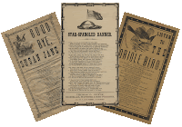
5/09/2011
The Creative Brief

Chromolithography is a method for making multi-color prints. This type of color printing stemmed from the process of lithography, and it includes all types of lithography that are printed in color. Package design chromolithographed on tin for food and tobacco produces used bright flat colors, elaborate lettering, and iconic images to create an emblematic presence for the product.
Lithographers sought to find a way to print on flat surfaces with the use of chemicals instead of relief or intaglio printing. Chromolithography became the most successful of several methods of color printing developed by the 19th century; and mostly relied on using several woodblocks with the colors. Hand coloring also remained important; boy is colored elements of the official British Ordnance Survey maps by hand until 1875.
I believe that the client is both men and women (any age). I see them shopping in the grocery store buying food. They see this bright flat colors product and they wonder what it use is for? On the other hand, what it may taste like? They are curious about the color or shape of the product.
The message of Chromolithography is a way to get you to buy (or try) this. In a way Chromolithography is like advertisements with images... relied heavily on an initial black print was not always a lithograph.
I believe the strategy of this product is a little crazy and old fashion.
http://arh346.blogspot.com/2007/09/package-designs-chromolithographed-on.html
5/04/2011
Design History
Design History
The other day we talk about many interesting pieces of art. Just like the Sumerians who developed writing language that increase knowledge, stabilized laws, and made out of clay. Then we talk about Egyptians who use hieroglyphics and who develop the papyrus and manuscripts that tell stories.
Next we talk about was the alphabets. Many people (countries / nation) have their own alphabet, for example…
· Cretan alphabet used pictographs and Minoan civilization.
· Phoenician alphabet arose from a need for communication. In addition, it develops sound speech rather than objects (pictographs).
· Phoenician alphabet arose from a need for communication. In addition, it develops sound speech rather than objects (pictographs).
· Greek alphabet adopted the Phoenician in 800 BC and is used for knowledge.
· Latin alphabet was adopted by the Greek alphabet, was revising, and charges the letters.
I pictures that I found is the "Wounded
Bison Attacking a Man"
is a cave painting from Lascaux, France that was painted somewhere around
15,000 years ago. It's amazing how these people created paintings.

May 2011
Collge life...
I started at Robert Morris University (RMU) Dec. 2011 as a full-time student getting my bachelors in graphic design. And at the same time I was a full-time student finishing up with my associated degree in Graphic Arts & Desktop Publishing. As I juggled 2 full time college I also went to work part-time. I was so happy that those few weeks went by so fast!!!
Now I am still at Robert Morris into my 3 Quarter... Counting the days till graduation. (Feb 2012)
Subscribe to:
Posts (Atom)